Choosing Your Colors

Colors Have Impact

Just because you love a color doesn’t mean it should be your BRAND!

There is science behind color theory and it’s a beautiful combination of art and science to determine which colors go well together. To help with this, we are going to look at the color wheel. Do you remember those from grade school?

The color wheel was invented by Sir Isaac Newton way back in 1666! He mapped out the color spectrum into a circle or wheel, and it’s the basis of color theory as it shows the relationship between the colors.

spectrum color palette for the post choosing your colors
Example of a color wheel

Two Types Of Color Wheels

There are two different color wheels for what we’ll be talking about today.

The First Is The RYB Or Red, Yellow, and Blue Color Wheel. This is also the one we learned in grade school. It’s used by artists and allows them to combine colors by knowing where the colors are on the wheel.

The second one is the RGB or Red, Green, and Blue wheel which is used by designers online as it has to do with mixing light.

This is also why creators of digital products struggle with what they see on the screen versus what they get when they print it out.

Canva defaults to RGB and is meant for online or digital products. That doesn’t mean it’s not good for printing, Canva is amazing! Just be aware the colors may differ. It’s always a good idea to print your product (like the workbook shown below) before you post it to verify it prints as expected and to make sure the colors look like you want them to.

Complementary Color Combinations

Example of a color wheel and a person holding paint swatches over the color wheel for the blog post

You might also remember this from school! It just means two colors that are on the opposite side of the color wheel. It offers a high contrast combination and visual impact.

Colors that are opposite each other give the greatest contrast, but that doesn’t mean you have to pick them!

Red and turquoise are opposite and look great together, but you could also go with a color to one side or the other if you desire.

The BEST place to start is what color speaks to what you want to do?

NOTE: Swatches from the paint store are also an excellent way to pick a color palette! 

Monochromatic Color Combinations

That just means three shades or tints of one base color which offers a more subtle mix of colors. So you could pick green like in the photo above. The paint chip card shows the various tones or tints of color.

To get a monochromatic combination simply pick three of the colors on that card. One light, one medium, and one darker shade.

There Are Many More Options

For more information on colors, be sure to go to the Canva color palette read what it says about each color and the color options, or do a search for color palette. For the purpose of this article, we won’t be covering all of the choices. For that kind of information check out a local artist class.

An example using a Monochromatic (Shades) Color Palette

As you can see on this Course Outline Workbook, I’ve gone with SHADES of one color. It’s subtle, yet professional and to add a little contrast I made the table legs pop!

Simple is often better.

When picking colors keep these things in mind.

  • Just because it’s popular doesn’t mean you have to use it.
  • Silver and gold look good on the screen but are very difficult to achieve on the printed page.
  • Red is great but may be much bolder than you expect for the user/viewer. So, be sure to use it in print and on the screen to determine the amount you want to use.
  • Although there are those that can wing picking a good color combination, I want to encourage you to use a color palette generator to get started.

Using colors on purpose

Example of a blog post image done in Canva

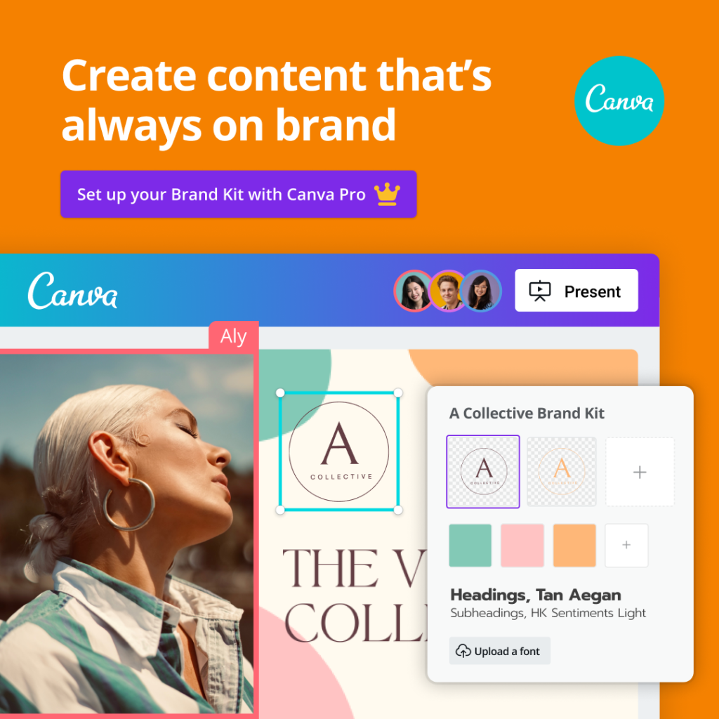
Canva is an online design and publishing platform or tool with free and paid-for options.

It allows the user to create designs like the one shown here quickly and easily. This is also a great example of a color palette.  

Notice how the pinks and greens go well together, look nice and give a calming and peaceful feeling to the blog post image?

NOTE: With the Canva color palette generator, you could upload this photo to it and get back the colors in the photo! 

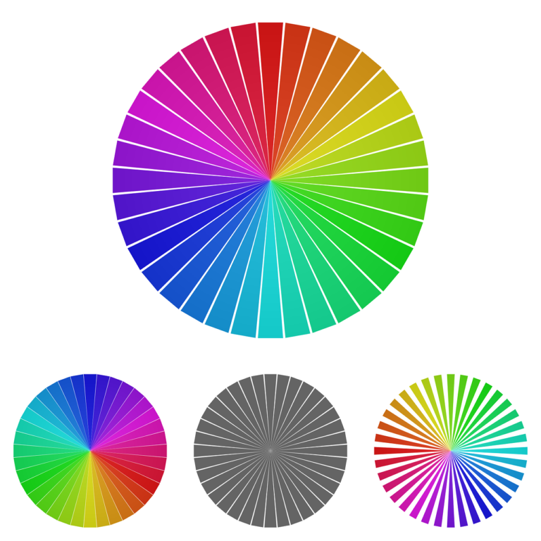
So, find a photo you love and upload it to determine the colors that are speaking to you.

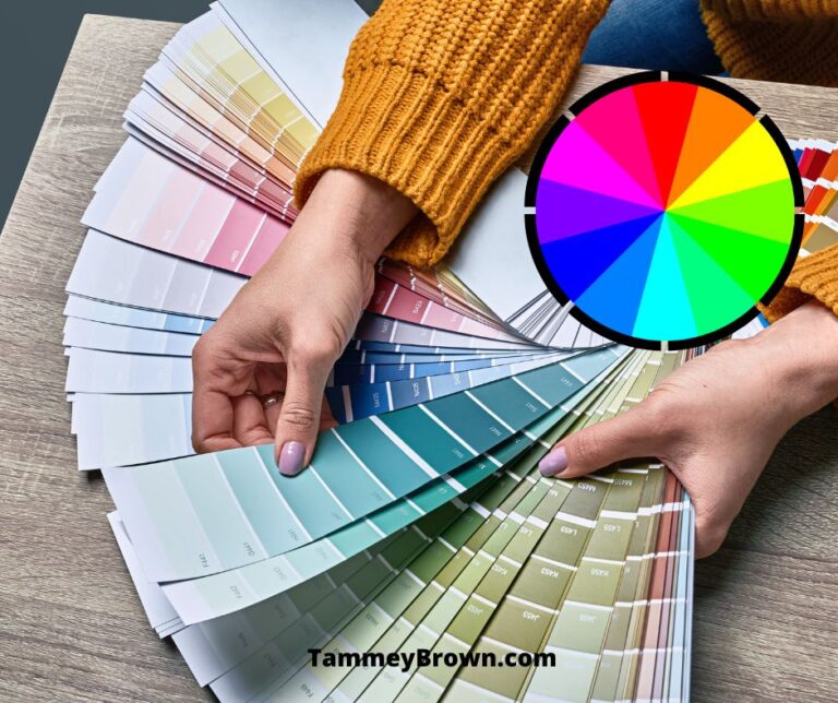
What colors speak to you? Are there colors that are commonly found in your line of work?

A fire department may consider red, whereas a clinic probably would not 🙂

 Go to the canva color palette generator

Go to https://www.canva.com/colors/color-palette-generator/ to access the free color palette generator from Canva! You can also learn about the colors and what they mean.

Select 3-5 colors 

It’s important to have at least 3 colors (like on a paint swatch which is monochromatic or complimentary ones and don’t forget that splash of color too!) in your palette, 5 is even better as it gives a little variety. The first color is the one you use the most, but you also want a punch of color to offset that one. 

For me, my punch is royal purple, but sometimes I use coral/orange. Because I have a predetermined palette, I know the exact number of the color. That means whenever I want purple I’m picking the exact same shade every time!

That’s what creates the branding. You’ve seen this. We all refer to ‘that’ red as Coca-Cola red and when I say it you know exactly what red I mean. That’s branding!

Good Luck and have fun!

It doesn’t have to start out perfect! You can edit, change, and rearrange as you go. The important thing is to START!

choosing Your colors - So many choices!

Pinterest is an amazing resource when developing your brand (your colors and feel).

I love going to Pinterest and typing in Brand Board and then browsing through all of the returned images! So many amazing options out there!

I’ve saved a bunch to my own Brand Board ideas board and linked to it with the image shown here. Feel free to see what I’ve already saved and, hopefully, be inspired by it!

Just create a board on your Pinterest account and save what you love there!

Canva Offers A Free And Paid-For Option! Easy To Use Too!

Canva lets you set your BRAND Kit! And TEACHERS can access Canva for Education for FREE!

Browse templates to get inspiration! If you love what you see, what are those colors?

This Canva template set can be seen by clicking on the image or going to Learn More HERE

Need a Logo?

Leave a Comment

Your email address will not be published. Required fields are marked *